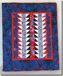
When I created the first notepad that appeared in the book, I made it with a little too much border on the left side and not enough border on the right. See: Exhibit A. [Please try to ignore my truly awful camera skills. I see time with an instruction manual ahead. Like before my next post.] Today, I finished another notebook. This time the border on the right is too large and the border on the left is too small. See: Exhibit B.
  Clearly Goldilocks (whose golden tresses are actually a little more Old Gray Mare) needs to try again. But as every good children’s story tells us, third time’s a charm . . . right?
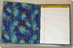
Never mind, I console myself: I really like the way the smaller notepad in taupe came out. And as far as the centering goes? Good E-nuff, says I. Here’s the inside view of the larger notepad:
 My obvious difficulties with centering aside, I love these guys. They are one of my favorite ways to display a miniature quilt.


No comments:
Post a Comment